
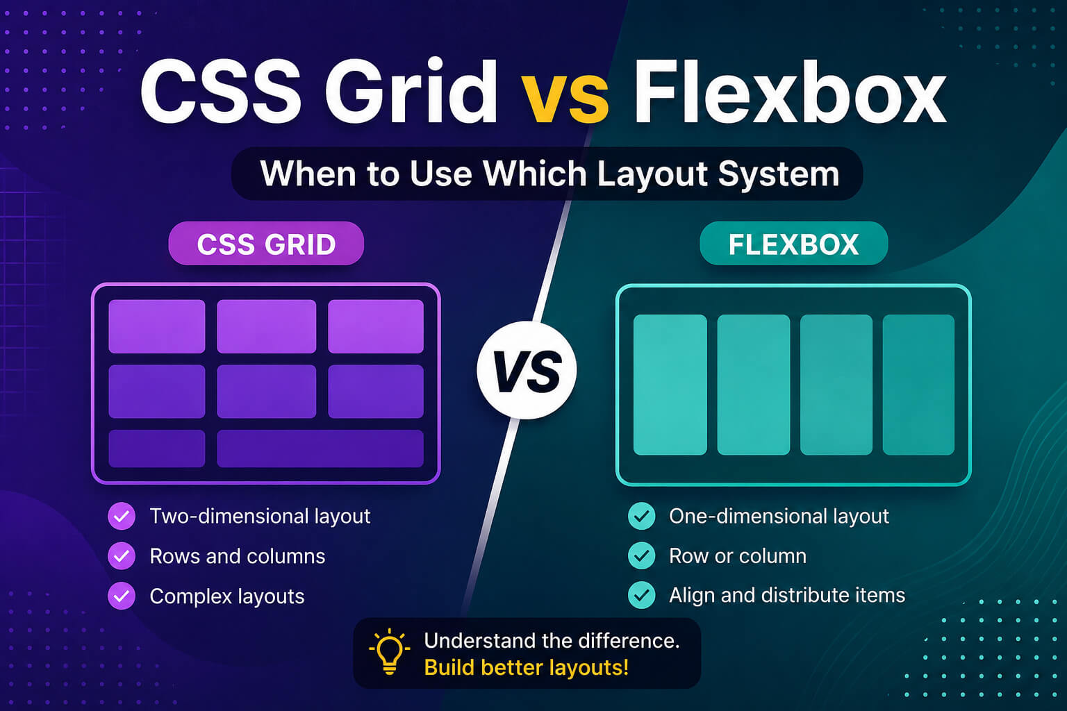
If you’ve spent any time writing CSS, you’ve probably run into both CSS Grid and Flexbox. They look similar on the surface — both are layout tools, both are powerful — but they solve very different problems.
Choosing the wrong one doesn’t break your page, but it does make your CSS harder to read, harder to maintain, and sometimes harder to make responsive. In this guide, you’ll learn exactly when to reach for Flexbox and when Grid is the better call — with real examples you can use today.
What is Flexbox?
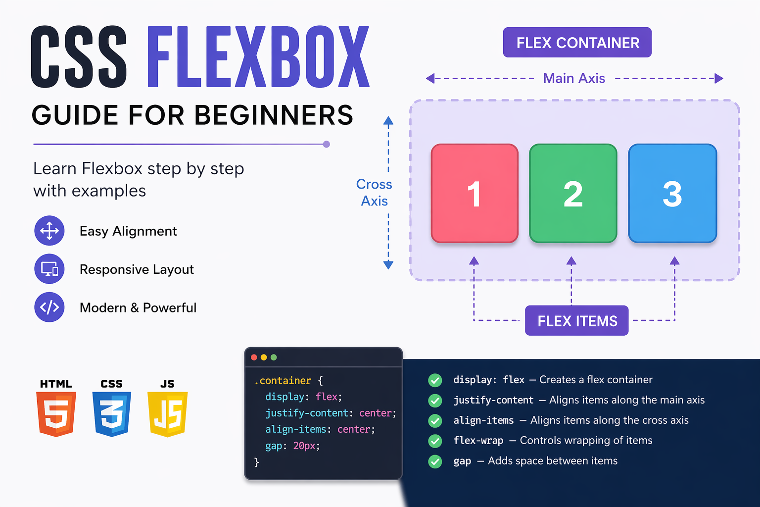
Flexbox — short for Flexible Box Layout — is a one-dimensional layout system. It works along a single axis at a time: either a row (horizontal) or a column (vertical).
Think of Flexbox as a tool for arranging items in a line — spacing them out, centering them, aligning them. It’s perfect when you have a group of elements and you want to control how they sit next to each other.
.navbar {
  display: flex;
  justify-content: space-between;
  align-items: center;
}
The above code is a classic Flexbox use case — a navigation bar where the logo sits on the left and links sit on the right. Simple, clean, done in 3 lines.
What is CSS Grid?
CSS Grid is a two-dimensional layout system. It works with both rows and columns at the same time.
Think of Grid as a spreadsheet — you define the rows, define the columns, and then place items anywhere inside that structure. It’s the right tool when you need to build an actual layout, not just a row of items.
.page-layout {
  display: grid;
  grid-template-columns: 250px 1fr;
  grid-template-rows: auto 1fr auto;
  min-height: 100vh;
}
This creates a two-column layout with a sidebar and main content area — something that would be messy and fragile to build with Flexbox.
The key difference: 1D vs 2D
This is the single most important thing to remember:
- Flexbox — one direction at a time (row OR column)
- CSS Grid — both directions together (row AND column)
Everything else flows from this. If you’re laying out items along a single line, use Flexbox. If you need to control both rows and columns together, use Grid.
When to use Flexbox
Flexbox shines in these situations:
1. Navigation bars
.nav {
  display: flex;
  justify-content: space-between;
  align-items: center;
  gap: 1rem;
}
2. Centering a single element
.container {
  display: flex;
  justify-content: center;
  align-items: center;
  height: 100vh;
}
This is probably the most-used CSS trick on the internet — and Flexbox makes it two lines.
3. Button groups and toolbars
.btn-group {
  display: flex;
  gap: 8px;
}
4. Card content layout (inside the card)
.card {
  display: flex;
  flex-direction: column;
  justify-content: space-between;
}
Use Flexbox inside your cards to push the button to the bottom. Use Grid for the card grid itself.
5. Wrapping items that should flow naturally
.tags {
  display: flex;
  flex-wrap: wrap;
  gap: 6px;
}
When to use CSS Grid
Grid is the better choice when:
1. Full page layouts
.page {
  display: grid;
  grid-template-areas:
    "header header"
    "sidebar main"
    "footer footer";
  grid-template-columns: 260px 1fr;
  grid-template-rows: auto 1fr auto;
}
Named grid areas make your layout readable at a glance. Flexbox can’t do this cleanly.
2. Card grids with equal columns
.card-grid {
  display: grid;
  grid-template-columns: repeat(auto-fill, minmax(280px, 1fr));
  gap: 1.5rem;
}
This single line creates a fully responsive card grid — no media queries needed.
3. Overlapping elements
.hero {
  display: grid;
}

.hero-image,
.hero-text {
  grid-area: 1 / 1;
}
Both elements occupy the same grid cell, letting you layer them. Flexbox can’t overlap items.
4. Strict alignment across rows and columns
When you need items in different rows to line up perfectly — like a pricing table — Grid is the only clean solution. Flexbox rows are independent; Grid rows share column definitions.
Can you use both at the same time?
Absolutely — and you should. Grid and Flexbox are not competitors. The most common real-world pattern is:
- Use Grid for the outer page structure
- Use Flexbox inside each section or component
For example:
/* Grid controls the overall layout */
.page {
  display: grid;
  grid-template-columns: 260px 1fr;
}

/* Flexbox handles the navbar items inside the header */
.navbar {
  display: flex;
  justify-content: space-between;
  align-items: center;
}

/* Flexbox stacks content inside each card */
.card {
  display: flex;
  flex-direction: column;
  gap: 12px;
}
Quick decision guide
| Use case | Use |
|---|---|
| Navbar / header | Flexbox |
| Centering one element | Flexbox |
| Button row / icon row | Flexbox |
| Card content (inside) | Flexbox |
| Full page layout | Grid |
| Card grid (outside) | Grid |
| Dashboard layout | Grid |
| Overlapping elements | Grid |
| Responsive columns | Grid |
Common mistakes to avoid
- Using Flexbox for a full page layout — it works, but it gets messy fast. Use Grid.
- Using Grid for a simple row of buttons — overkill. Flexbox is simpler and more readable.
- Forgetting
gap— both Grid and Flexbox supportgap. Stop using margins for spacing between flex/grid items. - Not using
auto-fillorauto-fit— these make Grid responsive without any media queries.
Final thoughts
There’s no rule that says you must pick one over the other. Both CSS Grid and Flexbox are part of your toolkit — and the best developers use both fluidly depending on what the layout actually needs.
The shortcut to remember: one direction = Flexbox, two directions = Grid. Start there, and you’ll make the right call 90% of the time.
If you’re new to Flexbox, check out the complete Flexbox guide for beginners on this blog before diving into Grid — it’ll make everything click faster.
Happy coding!


0 comments