
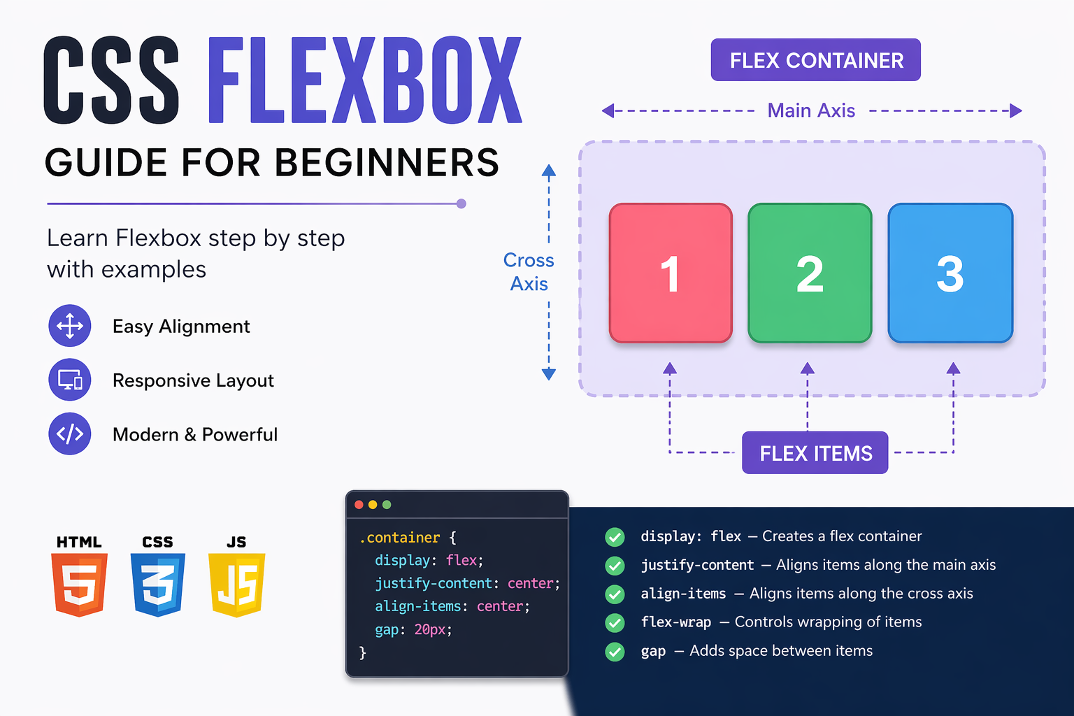
CSS Flexbox, also known as the Flexible Box Layout, is one of the most powerful layout systems available in modern web development. It was introduced to solve common layout problems that developers faced for years while working with CSS. Before Flexbox, aligning elements vertically or distributing space evenly across a layout was quite difficult and often required complex techniques like floats, inline-block, or positioning. These methods were not only harder to maintain but also less flexible for responsive design.
Flexbox provides a clean and efficient way to design layouts that automatically adjust based on screen size, content, and available space. It allows developers to align items, distribute space, and control layout direction with minimal code.
Understanding the Core Concept
Flexbox works based on two main components:
- Flex Container – The parent element
- Flex Items – The child elements inside the container
To enable Flexbox, you simply apply the following CSS:
.container {
  display: flex;
}
Once this is applied, all direct children of the container become flex items, and Flexbox rules start applying to them automatically.
Main Axis and Cross Axis
Flexbox works using two axes:
- Main Axis – The primary direction in which items are placed
- Cross Axis – The perpendicular direction
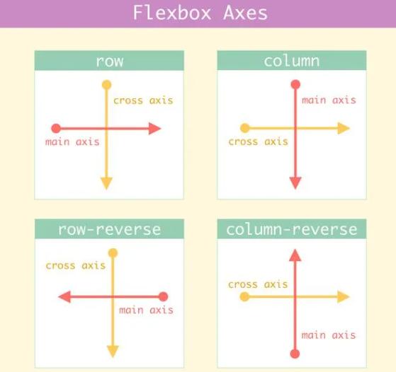
By default, the main axis is horizontal, and the cross axis is vertical. These axes change based on the flex-direction property.
Flex Direction
The flex-direction property defines how items are arranged:
.container {
  display: flex;
  flex-direction: row;
}
- row – Horizontal layout (default)
- row-reverse – Reverse horizontal layout
- column – Vertical layout
- column-reverse – Reverse vertical layout
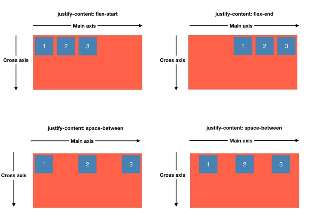
Justify Content (Main Axis Alignment)
This property controls alignment along the main axis:
.container {
  justify-content: center;
}
- flex-start – Align at the beginning
- center – Center alignment
- flex-end – Align at the end
- space-between – Equal space between items
- space-around – Equal space around items
- space-evenly – Equal spacing everywhere
Align Items (Cross Axis Alignment)
This property controls vertical alignment:
.container {
  align-items: center;
}
- stretch – Default (fills container)
- center – Vertical center
- flex-start – Top alignment
- flex-end – Bottom alignment
Flex Wrap
By default, items stay in a single row. You can enable wrapping:
.container {
  flex-wrap: wrap;
}
- nowrap – Default
- wrap – Moves items to next line
- wrap-reverse – Reverse wrapping
Gap (Spacing Between Items)
Flexbox provides a modern way to add spacing:
.container {
  gap: 10px;
}
This is better than using margins because it keeps spacing consistent.
Flex Item Properties
Flex Grow
This defines how much space an item should take:
.item {
  flex-grow: 1;
}
If all items have flex-grow set to 1, they share space equally.
Flex Shrink
This controls how items shrink when space is limited:
.item {
  flex-shrink: 1;
}
Flex Basis
This defines the initial size of an item:
.item {
  flex-basis: 200px;
}
Flex Shorthand
You can combine all three properties:
.item {
  flex: 1;
}
This is shorthand for flex-grow, flex-shrink, and flex-basis.
Real Example
.container {
  display: flex;
  justify-content: space-between;
  align-items: center;
}
This is commonly used in navigation bars.
Why Flexbox is Important
- Easy alignment of elements
- Responsive design without media queries
- Less code compared to older methods
- Better control over layout
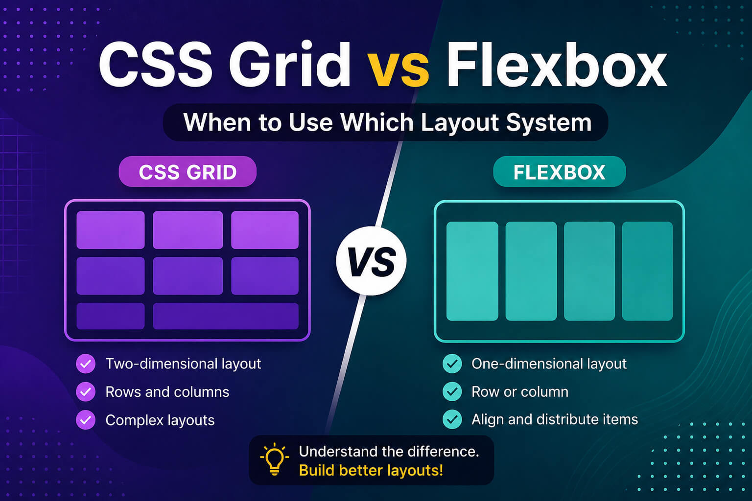
Flexbox vs Grid
Flexbox is used for one-dimensional layouts (row or column), while CSS Grid is used for two-dimensional layouts (rows and columns).
Common Mistakes
- Forgetting to use display: flex
- Confusing main axis and cross axis
- Overusing flex properties unnecessarily
Conclusion
Flexbox is an essential tool for every web developer. It simplifies layout design and makes it easier to build responsive interfaces. Once you understand its core concepts, you can create complex layouts with minimal effort.
Practice regularly and try building real projects using Flexbox to master it quickly.


0 comments