


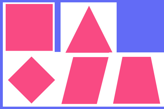
CSS clip-path is a powerful property that allows you to define custom shapes and apply them to HTML elements. It’s commonly used for creative UI effects, hover animations, and dynamic transitions. In this tutorial, we’ll explore how to build a clip-path animation using HTML and CSS, with optional JavaScript to trigger shape changes via buttons.
We’ll walk through the structure, styling, and interactivity step-by-step. By the end, you’ll be able to create animated shapes like triangles, rhombuses, trapezoids, and more—all with clean, responsive code.
🔧 What You’ll Build
- A shape container that animates between different polygon shapes
- Custom buttons to trigger shape transitions
- Responsive layout using HTML tables and CSS flexbox
- Optional JavaScript for dynamic shape switching
📄 HTML Structure
We start by creating a layout with a shape container and a set of buttons. Each button corresponds to a different polygon shape.
<link href="https://fonts.googleapis.com/css2?family=Roboto&display=swap" rel="stylesheet">
<div class="code-container">
  <table width="100%" cellpadding="15" border="1">
    <tbody>
      <tr>
        <td rowspan="5">
          <div class="element"></div>
        </td>
        <td><button type="button" class="animation-btn" data="0">Triangle</button></td>
      </tr>
      <tr>
        <td><button type="button" class="animation-btn" data="1">Rhombus</button></td>
      </tr>
      <tr>
        <td><button type="button" class="animation-btn" data="2">Parallelogram</button></td>
      </tr>
      <tr>
        <td><button type="button" class="animation-btn" data="3">Trapezoid</button></td>
      </tr>
      <tr>
        <td><button type="button" class="animation-btn" data="4">Square</button></td>
      </tr>
    </tbody>
  </table>
</div>
This layout uses a table to align the shape and buttons side-by-side. Each button has a data attribute that maps to a specific shape.
🎨 CSS Styling
Next, we style the container, buttons, and the shape element. The .element div is where the clip-path animation will occur.
body {
  font-family: 'Roboto', sans-serif;
  font-size: 14px;
}
.code-container {
  width: 450px;
  max-width: 100%;
  padding: 10px;
  box-shadow: 0px 0px 10px #0000000d;
  border-radius: 10px;
}
.code-container table {
  border-collapse: collapse;
  border-color: #e5e5e5;
}
.element {
  width: 200px;
  height: 200px;
  background: #f94a83;
  margin: 0 auto;
  transition: clip-path 1s;
  clip-path: polygon(0 0, 100% 0, 100% 100%, 0% 100%);
}
.code-container button {
  border: 1px solid #d7d7d7;
  padding: 6px 10px;
}
.code-container button:focus {
  background: #ed8686;
  border: 1px solid #ed8686;
  color: #fff;
}
🧠 Understanding Clip-Path
- clip-path: Defines the visible area of an element
- polygon(): Allows you to specify custom shapes using coordinates
- transition: Smoothly animates between shapes
Each shape is defined using percentage-based coordinates. This makes the animation responsive and adaptable to different screen sizes.
⚙️ JavaScript for Interactivity (Optional)
To make the buttons interactive, we use JavaScript to update the clip-path property dynamically.
var paths = [
  'clip-path: polygon(50% 0, 50% 0, 100% 100%, 0% 100%)',
  'clip-path: polygon(50% 0%, 100% 50%, 50% 100%, 0% 50%)',
  'clip-path: polygon(25% 0%, 100% 0%, 75% 100%, 0% 100%)',
  'clip-path: polygon(20% 0%, 80% 0%, 100% 100%, 0% 100%)',
  'clip-path: polygon(0 0, 100% 0, 100% 100%, 0% 100%)'
];
var buttons = document.querySelectorAll(".animation-btn");
for (var i = 0; i < buttons.length; i++) {
  buttons[i].addEventListener("click", function (e) {
    var target = e.target.getAttribute("data");
    document.querySelector(".element").setAttribute("style", paths[target]);
  });
}
This script listens for button clicks, retrieves the corresponding shape, and applies it to the .element div.
📚 Why Use Clip-Path Animations?
- 🎨 Adds visual interest to static layouts
- ⚡ Lightweight and fast-loading
- 📱 Responsive and scalable
- 🧩 Great for buttons, cards, loaders, and transitions
📱 Responsive Design Tips
- Use percentage-based coordinates for clip-path
- Test on multiple screen sizes
- Combine with media queries for layout adjustments
🛠️ Bonus Ideas
- Add hover effects to morph shapes
- Combine with gradients or background images
- Use SVG clip-paths for more complex designs
🔗 Live Demo
Check out the working example at code.bydev24.com/snippets/clip-path-animation







0 comments