


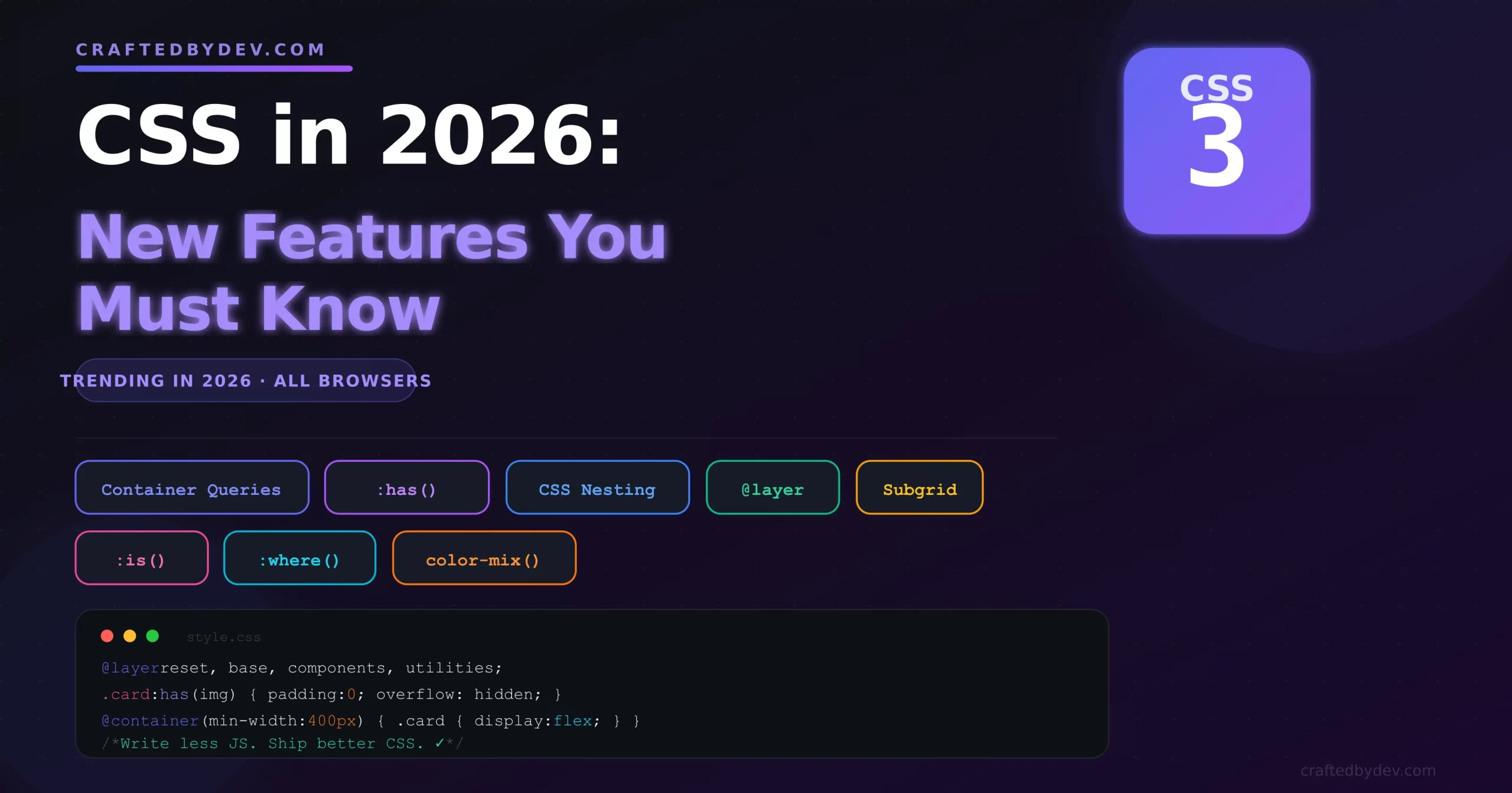
CSS has changed more in the last two years than it did in the previous ten. Features that developers once needed JavaScript or complex workarounds for are now built right into CSS — and most developers haven’t even heard of them yet.
If you’re still writing CSS the same way you did in 2022, you’re working harder than you need to. In this post, we’ll walk through the most powerful new CSS features in 2026 that are already supported in all modern browsers — with real examples you can use today.
1. CSS Container Queries — The layout game-changer
For years, @media queries let us style elements based on the viewport width. But that caused a big problem: components couldn’t adapt to their own container — only to the screen size.
Container queries fix this completely.
.card-wrapper {
  container-type: inline-size;
}

@container (min-width: 400px) {
  .card {
    display: flex;
    flex-direction: row;
  }
}

@container (max-width: 399px) {
  .card {
    display: flex;
    flex-direction: column;
  }
}
Now the .card component responds to the width of .card-wrapper — not the whole page. Drop that card anywhere on your site and it just works, no matter how wide the surrounding column is.
Why it matters: You can finally build truly reusable components. A card in a sidebar behaves differently from the same card in a full-width section — without a single extra line of JavaScript.
2. The :has() Selector — CSS gets a parent selector
Developers have been requesting a CSS parent selector for over a decade. It’s here, and it’s more powerful than you’d expect.
:has() lets you style an element based on what it contains.
/* Style a card differently if it contains an image */
.card:has(img) {
  padding: 0;
  overflow: hidden;
}

/* Style a form label if its input is focused */
.form-group:has(input:focus) label {
  color: #6366f1;
  font-weight: 600;
}

/* Style a list item if it has a nested ul */
li:has(ul) {
  font-weight: bold;
  list-style: disclosure-closed;
}
Why it matters: Before :has(), you needed JavaScript to detect what an element contained and add classes dynamically. Now CSS does it natively — cleaner, faster, and no JS required.
3. Native CSS Nesting — Write less, read more
If you’ve used SCSS or Sass, you’re already familiar with nesting. Now it’s built directly into CSS — no preprocessor needed.
/* Old way — flat selectors everywhere */
.nav { display: flex; }
.nav ul { list-style: none; }
.nav ul li { padding: 8px 12px; }
.nav ul li a { text-decoration: none; color: white; }
.nav ul li a:hover { color: #f7df1e; }

/* New way — native CSS nesting */
.nav {
  display: flex;

  ul {
    list-style: none;

    li {
      padding: 8px 12px;

      a {
        text-decoration: none;
        color: white;

        &:hover {
          color: #f7df1e;
        }
      }
    }
  }
}
Why it matters: Your CSS structure now mirrors your HTML structure. It’s easier to read, easier to maintain, and far easier to delete when you remove a component.
4. @layer — Finally control CSS specificity
Specificity wars — where one library’s CSS keeps overriding yours — are one of the most frustrating parts of front-end development. @layer solves this by letting you define the priority order of your CSS.
/* Define the layer order — later = higher priority */
@layer reset, base, components, utilities;

@layer reset {
  * { margin: 0; padding: 0; box-sizing: border-box; }
}

@layer base {
  body { font-family: system-ui; line-height: 1.6; }
  a { color: inherit; }
}

@layer components {
  .btn {
    padding: 8px 16px;
    border-radius: 6px;
    background: #6366f1;
    color: white;
  }
}

@layer utilities {
  .text-center { text-align: center; }
  .mt-4 { margin-top: 1rem; }
}
Styles in utilities will always win over components, regardless of which class comes first in the file — because you defined the layer order upfront.
Why it matters: No more fighting with third-party CSS using !important. Wrap external libraries in a low-priority layer and your styles will always take precedence.
5. CSS Subgrid — Align nested elements to the parent grid
CSS Grid is powerful, but child elements inside a grid item couldn’t align to the parent grid’s tracks. Subgrid fixes this.
.parent-grid {
  display: grid;
  grid-template-columns: repeat(3, 1fr);
  grid-template-rows: auto auto auto;
  gap: 1rem;
}

.card {
  display: grid;
  grid-row: span 3;
  grid-template-rows: subgrid; /* ← inherits parent row tracks */
}

.card-header { /* aligns to row 1 of parent */ }
.card-body   { /* aligns to row 2 of parent */ }
.card-footer { /* aligns to row 3 of parent */ }
Why it matters: Card footers now sit at the same vertical position across all cards — even when their content has different heights. Previously this needed JavaScript to measure and set heights manually.
6. :is() and :where() — Shorter, smarter selectors
These two selectors let you group multiple selectors together — but they behave slightly differently.
/* Without :is() — repetitive */
h1 a, h2 a, h3 a, h4 a, h5 a, h6 a {
  color: inherit;
  text-decoration: none;
}

/* With :is() — clean and readable */
:is(h1, h2, h3, h4, h5, h6) a {
  color: inherit;
  text-decoration: none;
}

/* :where() is the same but adds zero specificity */
:where(h1, h2, h3) {
  margin-bottom: 1rem;
}
Use :is() when specificity matters and :where() when you want styles that are easy to override (great for resets and base styles).
7. color-mix() — Mix colors directly in CSS
Generating tinted or shaded versions of a color used to require a preprocessor or JavaScript. Now CSS can do it natively.
:root {
  --brand: #6366f1;
  --brand-light: color-mix(in srgb, var(--brand) 30%, white);
  --brand-dark:  color-mix(in srgb, var(--brand) 80%, black);
}

.btn {
  background: var(--brand);
}

.btn:hover {
  background: var(--brand-dark);
}
Why it matters: You can build an entire design system of tints and shades from a single base color, entirely in CSS — no Sass functions, no JS, no design tool needed.
Quick reference — what replaces what
| New CSS Feature | Replaces |
|---|---|
| Container Queries | JS-based responsive components |
| :has() | JS class toggling based on children |
| CSS Nesting | Sass / SCSS preprocessors |
| @layer | !important hacks, specificity battles |
| Subgrid | JS height equalisation |
| :is() / :where() | Long repeated selector lists |
| color-mix() | Sass color functions, JS color libs |
Browser support in 2026
All seven features covered in this post are supported in Chrome, Firefox, Safari, and Edge as of 2026. You can use every one of them in production today — no polyfills needed.
The only thing to be careful about is very old browser versions (pre-2023). If your analytics show a significant portion of your users on older browsers, add a @supports check for container queries and :has() as a safety net.
@supports (container-type: inline-size) {
  .card-wrapper {
    container-type: inline-size;
  }
}
Final thoughts
CSS in 2026 is genuinely exciting. Features that required JavaScript, preprocessors, or complex workarounds are now native to the language. The result is less code, better performance, and components that are actually reusable.
Start with :has() and container queries — they’ll change how you think about writing CSS almost immediately. Then move to @layer if you work with third-party styles or design systems.
If you’re new to CSS layouts, start with the complete Flexbox guide for beginners before diving into these advanced features — it’ll give you a strong foundation to build on.
Happy coding! 🚀







0 comments